Woodforest had never funded outside user research. Convincing the CEO was the first study.
Design decisions at Woodforest National Bank had always run on internal expertise and opinion. No customer had ever been asked to validate one, because external, vendor-supported user research had never been funded. Before we could run a single study, we had to convince leadership it was worth paying for.
We built the case. I built the vendor matrix, made the ROI case with WEVO, and designed the deck that carried it up the ladder. That pitch ended with CEO approval, a WEVO contract, and nine studies. Eight of them put real customer data behind a redesign we had already shipped, and I specced five of the seven changes that followed.
(June–November 2025)

The highest of the nine studies. The Checking product page, on desktop.

The Problem
Our customer service logs showed where people were struggling: calls about the website, about specific products, about the mobile app. But a call log names a symptom, not a cause.
One symptom we kept returning to sat inside account opening, a fee we suspected was turning applicants away at the last step. The fee was the bank's, not something our team had designed, so we couldn't simply change it, and without evidence we couldn't get anyone to look at it. It wasn't the only one, either. We had a list and no way to rank it: which of these was actually costing the bank money, and which was just the loudest call. We could name what was wrong. We couldn't prove it.
Users & Audience
The audience for the pitch wasn't customers. It was our own leadership, the people who controlled budget and strategic direction, up to and including the CEO. Our department head was with us from the start. Above her, no one had ever had to justify paying an outside vendor for research, and no one was sure it was.
That was the belief we had to move: that proximity to the building was the same as proximity to the customer. We needed to prove that real data from customers of other banks who matched our own demographics would unlock revenue and reduce risk in ways internal opinion never could.


Process
Step 1: Finding a vendor worth pitching
The UX team approached our department head: we think vendor-supported UX research could transform how we make design decisions. She agreed, and challenged us to come back with a plan.
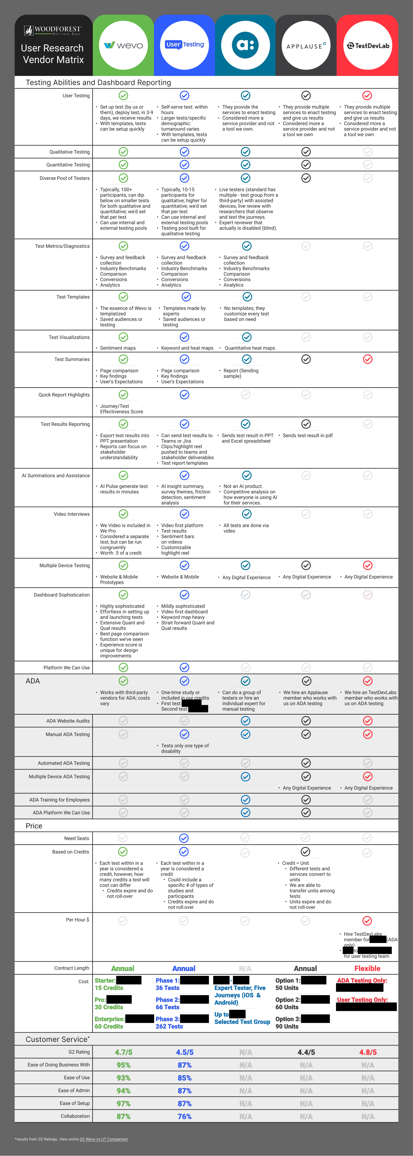
We took discovery meetings with dozens of vendors to understand what was possible, then carried five into a real comparison. I built a comparison matrix as we went, with guidance from our department head, and it turned out to be the thing that carried the rest of the process: every later conversation ran off it.
Step 2: Narrowing to one recommendation
The matrix cut the five to two finalists. UserTesting was capable, but it couldn't match WEVO on what mattered most to a buyer doing this for the first time, so we took a detailed proposal from WEVO alone: one name, not a shortlist.
- Pricing flexible enough for a starter scope
- A dashboard a non-researcher can read
- A dedicated researcher working alongside us
- Priced above a starter budget
- Reporting that needed training to read
Step 3: Pricing the ask
I took the proposal to our department head first. She had backed the idea from the start and knew the work, so convincing her was quick, and from there she carried it up through multiple leadership levels. Each level asked a version of the same question: why does this cost what it costs? She came back to us every time one of them pushed, making sure we had what the next conversation needed.
The answer that worked was never “research is good practice.” We priced it. WEVO had a model that converted customer service contact volume into the cost of handling it, so our team pulled the call logs and WEVO ran them through it, and the ask turned into a number. It stopped being a design expense and became a business case.
It helped that the CEO already knew our team. I had presented the website redesign to him, and other projects before that, so the proposal reached him from a group whose work he had seen firsthand. He approved it, and we had a contract with WEVO by December 2024.
Step 4: Choosing what was worth testing
Then the contract sat. Every hour the team had was going into finishing the redesign itself, which launched in July 2025.
Nine studies came out of a much longer list. Each had to clear three bars: the page had to be live or quick to stand up, we had to need the answer rather than merely be able to buy one, and it had to be our own design under test. The enrollment journey failed the third on purpose: we hadn't designed it, so it was the one study that didn't need the new site finished, and the fastest thing to put in front of testers, which made it the right study to learn the tool on.
They ran from June through November 2025, across desktop and mobile: the enrollment preview first, a month ahead of the launch, then the eight that tested the redesign from September on. I designed six of those eight, and my fellow senior designer took the other two. WEVO's embedded researcher reviewed our methodology, confirmed each study measured what we said it did, and advised on adjustments worth making, but the tests were ours. I turned the raw results into the stakeholder decks the business worked from, and presented them to our Director of Product Development and Customer Experience and to our Chief Retail Officer.
One of Nine Studies, Scoped
Design Aesthetic TestMobile
- Goal
- Evaluate how effectively the website's visual design supports a positive and intuitive user experience.
- Question
- Do visual elements enhance usability, build trust, and reflect the brand's identity?
- Audience
- Anyone under 65 who had visited their bank's website in the past three months.
Step 5: Acting on what came back
Going in, we were confident about the decisions we had made ourselves and less certain about the ones we had inherited. The Additional Benefits cards were a convention: it is what banking sites do, so we built them, without testing whether they earned the space they took.
Consider the Design Aesthetic Test on mobile. 126 people walked the redesigned pages in a prototype on their phone and rated them. The study scored 83, and 75% called the layout balanced. A further 21% called it cluttered: too much content, too much scrolling. So I designed for the 21%.
Their written answers never named a component. They named the symptom. Working out what was actually setting that length was mine to do. It landed on the Additional Benefits cards we had gone in suspecting, and on the gray cards beside them: two conventions repeated down every page that carried them. So I changed how they stacked.
Below a 575px viewport, the gray cards and the Additional Benefits cards take a thinner form: the image sits beside the copy rather than above it. I specced it on the Online & Mobile Banking product page.
It shipped in May 2026 as two of the seven tickets those studies put into a single tracked feature.
A re-org sits in the gap between the last study closing in November 2025 and the first of those tickets reaching the site in February 2026. Priorities moved with it. Every ticket in that feature shipped anyway.
From Finding to Shipped
-
01
Improvement
opportunity -
02
Design
exploration -
03
Decisions
made -
04
Shipped to
the live site
Solution
Decision 1: Buying for the audience, not the researcher. Problem tackled: We had no researcher of our own, so there was nobody to hand a pile of responses to. Whatever we bought had to do that work itself. How: I scored all five on the same capabilities, and weighted one hardest: how the output would read to someone who had never run a study. Why: The people deciding whether research continued after the first contract were never going to read responses; they were going to read a readout, and the first one had to land. The cost showed up later. Synthesis is what made the finding legible to the business. It is not what told me what to change.
Design Aesthetic Test, Mobile
“There was perfect spacing in information, text and icons. It was nice to be broken up with images as well.”
Very Balanced
“It was laid out well and I wouldn’t necessarily call it cluttered, but there was so much information on each page that it did blend together.”
Somewhat Cluttered
“Too much info on each page. Those of us with short attention spans will take one look and go elsewhere.”
Slightly Cluttered
- 75%
- Balanced
- 4%
- Neutral
- 21%
- Cluttered
Too much content, too much scrolling
Decision 2: Write it once, apply it everywhere. Problem tackled: Testers said the pages were too long. Two card types doing the same job were eating multiple scrolls between them. The complaints arrived attached to specific pages, so the cheap answer was to fix those pages and close the tickets. How: I wrote the change as a rule for the gray cards and the Additional Benefits cards rather than a fix for those pages. Why: The pages we tested were not special. They were the ones we happened to test, and the same two card types set the same length across the rest of the site. Our components are global in Umbraco, so writing the change as a rule sent it to every page those cards appeared on, including the ones nobody thought to complain about. Cutting the words was a different job. That copy came over from the old site precisely because Legal and Compliance had already cleared it, so editing any of it meant the content owner first, then Legal and Compliance again, then the same loop for every page the edit rippled into. None of that timeline was ours. Component size was the part we owned. So this takes out height, not words.
The Same Card, Before and After


I specced this on the Online & Mobile Banking product page. The card here is the same component on the homepage. On a 390px screen, the section holding it went from 3,590px to 1,098px.
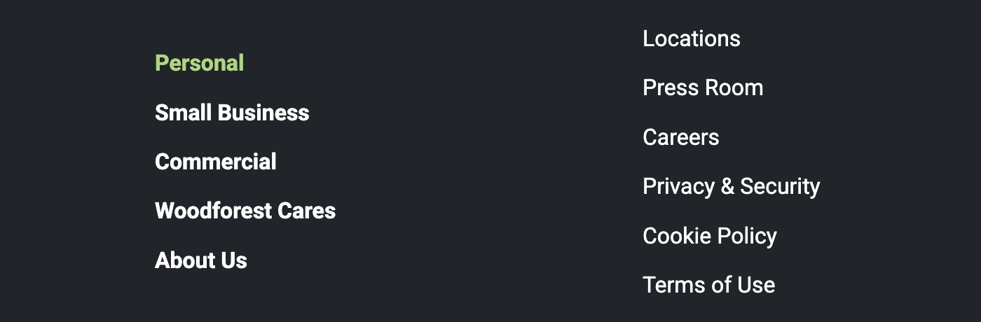
Decision 3: A finding is a candidate, not an instruction. Problem tackled: The menus study came back recommending a Privacy & Security link in the header, and a recommendation from research we fought to buy is a hard thing to turn down. How: I checked where it already lived, and what it would have to displace. It was in the footer and reachable, and it did not outrank anything already in the quick links, so we left it there. Why: The quick links are ranked by what someone came to the site to do. The reports produced candidates. Deciding which ones were real was still the job.
What the Link Would Have to Outrank, and Where It Already Was

Impact
Evidence outranked opinion: Every study that tested the redesign ran after it launched, so none of them could shape it. What they could do was confirm it held up in front of real bank customers, and then say where it did not. I presented the findings to stakeholders who had never commissioned outside research, we proposed the changes we wanted off the back of them, and they approved. I specced most of what shipped; execution went to my manager.
Read the studies
Every study below is the real WEVO report. Six of the nine also carry the stakeholder deck built from it. Those are downloadable too.
Every study raised at least one improvement opportunity, and some raised more. Five of the nine reached the live site, as seven tickets under one feature, one of them raised by both product-page studies at once. A sixth is redesigned and waiting on engineering. Three studies raised opportunities that never became tickets of their own.
WEVO Experience Effectiveness
Diagnostics Against Benchmark
Five per study against a WEVO industry benchmark set, 45 in all. 13 scored above the benchmark, 29 at it, and 3 below. All three below sit in the two lowest-scoring studies: Online Banking Enrollment, a journey we had not designed, and Website Menus, which we rebuilt.
-
90
Product Page (Checking)Desktop
An interest-rate button in account info, and a “Most Popular” banner our CRO asked forShipped
-
88
Locate a Branch TestDesktop
A US map on the Locations pageShipped
-
87
Design Aesthetic TestDesktop
Eliminate excess on pagesRaised
-
86
Product Page (Savings)Desktop
The interest-rate change again, raised independently by this studyShipped
-
83
Design Aesthetic TestMobile
Thinner Additional Benefits and gray cards, site‑wideShipped
-
82
Website UX/Functionality TestDesktop
Improve page flows and featuresRaised
-
82
Website UX/Functionality TestMobile
Improve page flows and menus (the rebuild below answered the menus half)Raised
-
80
Online Banking Enrollment StudyDesktop
Enrollment journey redesigned, delivered to engineeringQueued
-
78
Website MenusDesktopBank of America
A white search field in the header, and a rebuild of the site menusShipped
What those changes did to call volume, or to conversion, is the one thing this study cannot tell you. We never measured it. The closest thing to an answer lives one study over, where account-opening visits went from 1,526 to 33,444 a month.
See the Website Redesign Case Study →The second phase: The department head who had backed the first contract told us it would be renewed, and we were far enough along to be pricing a two-year term against the one-year for the discount. We scoped the next phase with WEVO on that basis, and it was where the pain-point list this study opened on would finally get ranked:
- Expand studies across digital areas and banking products, including more complex tasks and cross-device journeys
- Build a customer feedback pool: real customers who opt in to give feedback over time, enabling longitudinal research
- Integrate research checkpoints into the design and development process so teams plan work with user evidence in mind
Then the re-org moved us to a new department, and the contract never came. The reason we were eventually given was the objection this study opened with: that Woodforest employees could be tested instead. We made the case again, updated, with the documents that had convinced a department head and a CEO the first time. It did not carry twice.
Learnings
Learning 1: I expected the report to name the components, and it named the symptom. The report said the redesigned pages were too full and took too much scrolling. Where it did point at a cause, it pointed at promo content. The cause was the gray cards and the Additional Benefits cards, quietly setting the height of every page they sat on. Nobody was going to hand me that. I read the individual responses before the summary now, and I measure the thing I suspect before I argue for changing it.
Learning 2: I nearly brought them two vendors to choose between, and a choice is what gets deferred. We could have put WEVO and UserTesting side by side and let leadership choose, but an unresolved decision reads as an incomplete evaluation and invites the whole question to be deferred. We narrowed it ourselves and brought the matrix with it, so the vendor question was answered on the page. The cheaper option they kept coming back to was always the cafe, and that one was answered the way the contract had been won: by pricing what the research would return.
Learning 3: I asked for less than the budget allowed, because an enterprise commitment would have bought capacity we had no way to spend. The budget set a ceiling, and we came in under it anyway. We were a three-person UX team, and I was going to be running most of the testing myself. A smaller number is easier to approve, and easier to deliver against.
Learning 4: I had a CEO's yes, and it retired when he did. By the time we asked again, neither sponsor was ours anymore. The CEO who approved the first contract had retired, and the re-org had moved us out from under the department head who carried the case up, and under one who was never in the room. What outlasted the funding was the work it had already produced, so I bank the shipped change while the mandate lasts.