Nearly the same traffic, 22× the account-opening visits: what changed was the structure.
Woodforest National Bank's public website was overdue for a complete overhaul: visually outdated, fully unresponsive on mobile, and built on an unstable CMS that limited what the team could build and maintain.
The redesign was handed to me in 2022 as its lead designer. The information architecture was a full-team decision that I led, and I structured it; the design system was mine apart from a few pieces a co-designer added later, and I directed the design team that executed against both. Nearly three years and 330+ pages later, the new site launched in July 2025.
(11,000 → 15,000+, bank-wide)
(1,526 → 33,444, on the site)
(four IA tiers, three breakpoints)
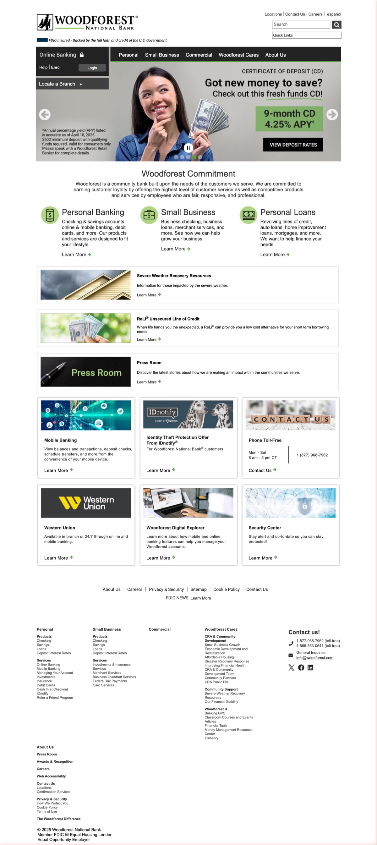
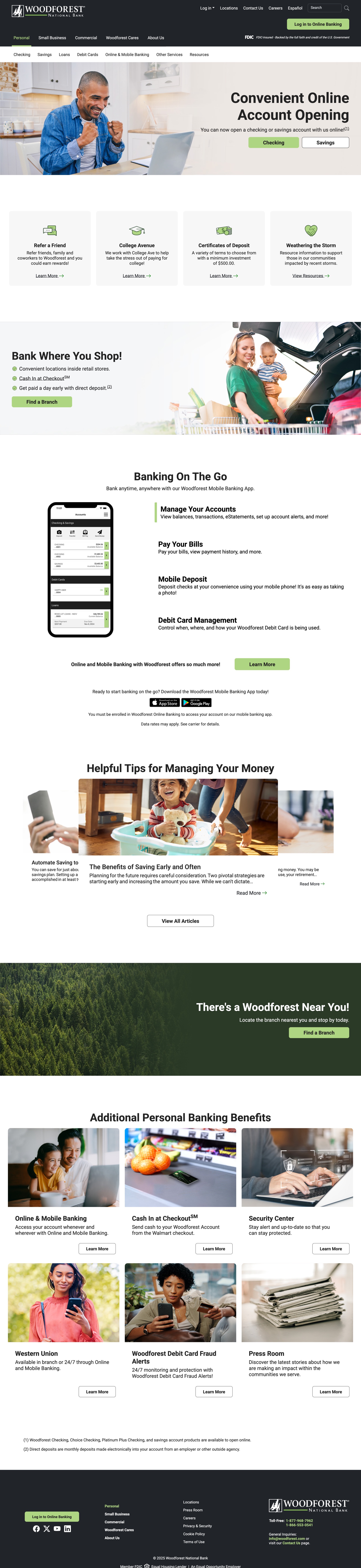
The full Woodforest.com homepage, before and at launch. The old design ran until July 2025, when the redesign replaced it.

The Problem
Woodforest's website was never only a UX problem, it was a revenue problem. Checking and savings were the two accounts the bank most needed people to open, and the homepage gave neither one a tile of its own. The closest the body came was a Personal Banking tile that dropped you on a landing page. It wore the same Learn More as a press room, an identity-theft partner, and a money-transfer service. Eleven of the twelve tiles down the body carried that same Learn More, so eleven different destinations asked for one undifferentiated click. Heat maps found another hole in the same page: the carousel banners across the top, the most valuable space the bank owned, drew almost no engagement. And that Personal Banking tile wasn't even a link: the click sat on its wrapper, and the two anchors inside carried no href, so a keyboard never reached it.
Underneath it, an unstable CMS made the site dangerous to change. Publishing an edit to a single page could take the whole site down. A rebuild was already the plan; what the bank had not had was the design capacity to run one. It needed a platform where one page could change without risking the rest, and a structure that put what customers actually came for on the front door instead of behind a dropdown.
See the Old Site on the Wayback Machine →Users & Audience
Two groups arrive with opposite goals, and the old site served neither well. Existing customers come to do one thing and leave: log in, find a routing number, check a fee. My argument for them was that time spent hunting ends in support calls the bank pays to answer. Prospective customers arrive undecided and need to compare products before they will commit, which is a slower, higher-stakes path.
The old site also had a batch of pages sitting outside the navigation with no home to route to. The tiered IA is what gave them a home and let one site serve both groups at once: existing customers got a predictable path to a known destination, prospective ones got a structure they could explore without getting lost. What it cost was certainty for the people who already knew the old site. We rearranged the site into the shape we believed made better sense, and anyone who had learned where things lived had to learn again. Where the split came from: not interviews. The analytics were anonymous, so they could not tell me who was who, only which paths the traffic took. The two groups are my reading of those paths.


Process
Step 1: Child pages under the wrong parents
I started with a full audit of the old site: screenshots of every page, a complete sitemap, an analysis of the existing information architecture, and the heat map and analytics data underneath it. What it turned up was structural rather than cosmetic. Child pages sat under the wrong parents, the same content was being maintained on several pages at once, and the routes to the things customers came for ran through places they had no reason to look. In parallel, I studied how other financial institutions structured navigation, grouped personal and business content, promoted online banking, and displayed product pages, both informationally and visually. Why scrutinized, not adopted: those patterns were groundwork, not a template. Staying inside the mental model of a bank's website is what made room for Woodforest's own spin on it.
Step 2: Four tiers, and no separate homepage
We rebuilt the IA from the ground up, deciding as a team what to keep, consolidate, and cut. I led that work and set the structure it landed on: every page in one of four tiers, numbered so its position in the hierarchy was unambiguous. Tier 1 is the main navigation, and its Personal page is the homepage. We never built a separate one: personal accounts are the product the bank earns on, and fronting them is what a banking site is expected to do. Every other section then got its own landing page off that same template. Why the numbering mattered: a page's number named its parent, so where something belonged stopped being a matter of opinion.
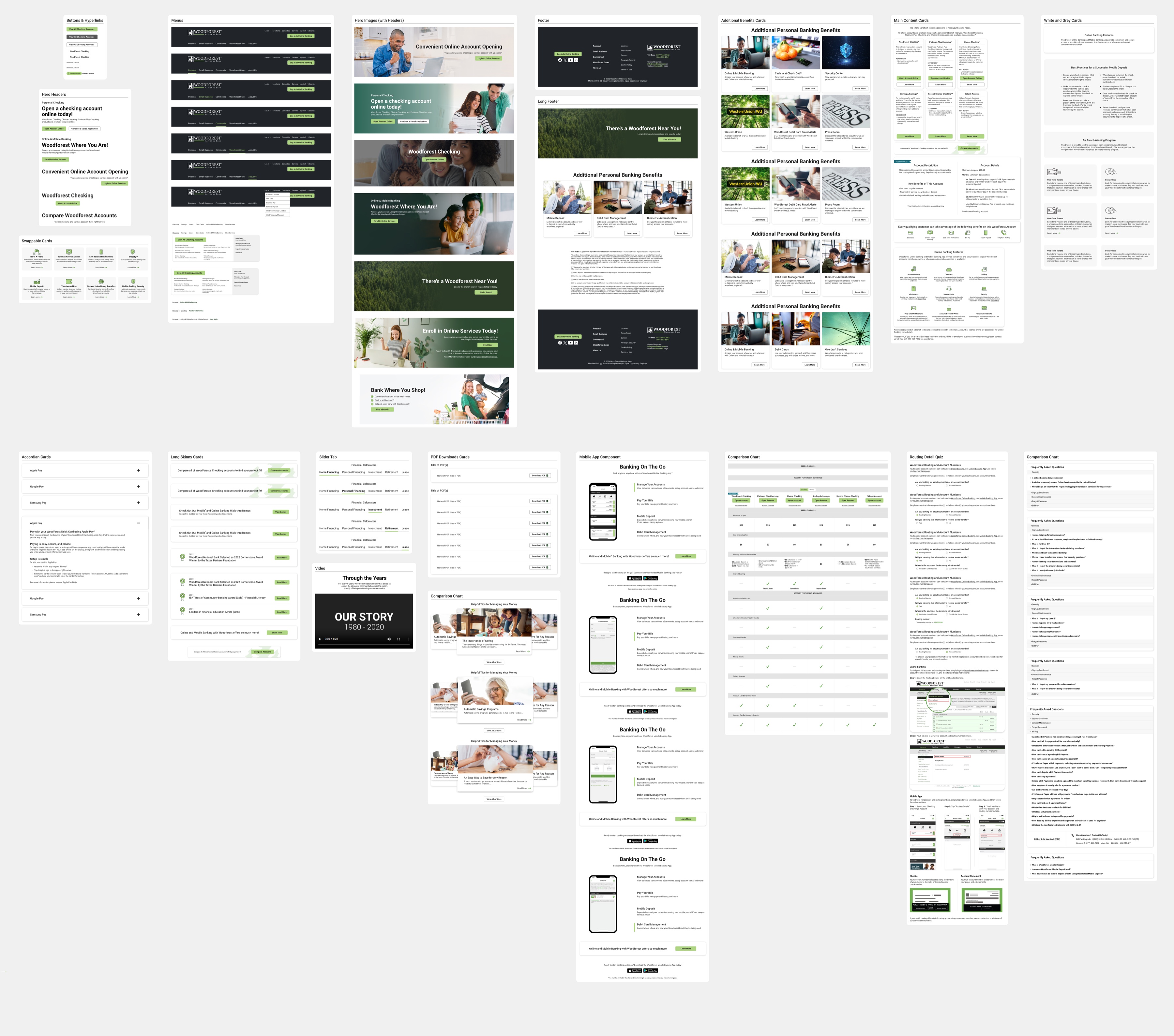
330+ pages, every one of them in exactly one tier, and a page's tier is also its template. Tier 2 needed two, which is how four tiers produced five templates. The dark pills are the five pages those templates were designed on, picked to cover the route a customer actually takes: read up on online banking, compare the accounts, then open one.
-
Tier 1 Main Navigation1.0Personal 2.0Small Business 3.0Commercial 4.0Woodforest Cares 5.0About Us
-
Tier 2 (A) Product Offerings1.1All Checking 1.2All Savings 1.3All Loans
-
Tier 2 (B) Service & Resource1.4Debit Card 1.5Online & Mobile Banking 1.6All Other Services 1.7Resources
-
Tier 3 Product & Content1.1.1Woodforest Checking 1.1.2Second Chance Checking 1.1.3Choice Checking 1.1.4Sterling Advantage 1.1.5Platinum Plus Checking 1.1.6WBank Account
-
Tier 4 Detail & Utility1.1.7Checking Product Comparison Chart 1.5.3.1Bill Pay 5.2.1.1Branch details 404, speedbump & other ungrouped pages
Step 3: Components before pages, and no breadcrumbs
We wireframed the tier pages, designing for all three breakpoints from the start: I took desktop and tablet, and the co-designer built the mobile views to my direction. The CEO's brief was to honor what was familiar while modernizing. Once the direction was approved, I built the component library using atomic design principles: I designed the individual components first, then stacked them into the hi-fi pages. The one component I proposed cutting was breadcrumbs, and the team agreed. A four-tier hierarchy is the textbook case for them, so I had drawn them, and the trail is still in the templates below, in the row the second-level nav now occupies. It came back out during dev translation, once building the pages showed what a trail actually did here: its links only walk you back up the path you came in on, and from a product page that is the only move it offers. The second-level nav opens on hover, so you can cross to a different page in the branch without retracing. It also stays on the page, marks the branch you are in, and shows the siblings and children a trail hides. What the nav does not show is how deep in that branch you are, which is the one thing a trail would still have done better. Why components first: once the five templates were locked in, we could replicate them across hundreds of pages without re-solving the same layout problems.
Step 4: Selling the structure, not the screens
Before committing to hi-fi, we needed the CEO's approval on the direction, so I presented it on a prototype built from our lo-fi wireframes, walking one of our main happy paths end to end. I framed every decision in business terms: how the new IA would reduce friction in account opening, how responsive design would reach the mobile audience the old site couldn't serve, and how the visual modernization would build trust without alienating existing customers. Why lo-fi: committing the team to hundreds of hi-fi pages first would have risked the whole schedule on an assumption.

Explore the system
Each template is shown through one example page whose pattern drives every page like it: the Tier 2 (A) Product Offerings pattern carries All Checking, All Savings, All Loans, and their small-business counterparts.
Step 5: The only one who knew both sides
With a dedicated developer and Umbraco Cloud as the CMS, a platform where a page publishes on its own, the build began: the most operationally complex phase of the project, every page across all three breakpoints. I was the primary bridge between design and dev: translating specs, flagging implementation gaps, and building 100+ pages directly in Umbraco myself. The co-designer stayed on through the build, executing pages at scale within the system I'd established, and added a few components to it along the way. Why it fell to me: I was the only person who knew both the design system's rules and the CMS's limits, so I could tell a real constraint from a preference.
Step 6: The defect desktop couldn't show
My manager and I led QA and UAT across all 330+ pages: we built the review framework and coordinated the effort, and the rest of the design team executed against it and served as second reviewers, so no page shipped on a single set of eyes. The catch that justified it was structural: the FAQ component's category tabs held at desktop and broke on mobile. Because the fault was in a component, one fix corrected every page that used it. Why every page at every size: the defect was invisible on desktop and would have been invisible in a sample.
Solution
Decision 1: A system, not 330 pages. Problem tackled: Nothing tied the old site together. Pages sat where they had been added rather than where they belonged. How: I structured the IA into four tiers and built the component library against it. I drew one line the system does not cross: the picture in the hero. The frame is the system's, the picture is the page's. Every page added or updated since has cost us a hunt for a new one, and I would draw the line there again: it buys each page its own human moment above the fold. Why: At this scale consistency can't be maintained page by page, only enforced by a system. It also made the copy constraint survivable: the words were fixed before the project started, so placement and treatment were the only levers left, and only a system moves those across 330+ pages at once.
Decision 2: Modern, but unmistakably a bank. Problem tackled: The site looked a decade old, but a bank's visual conservatism isn't only inertia: it signals stability to people trusting you with money. How: Seven type styles on a single typeface, named by role rather than size, so Body, Secondary Body, and Disclosures were decisions made once and reused. Thirteen colors, with the neutrals naming their own job in the swatch: use for card outlines, use for lines, use for search links. All of it drawn from Woodforest's existing identity rather than a new one. Why: Not a fintech startup, a bank that knew what it was doing in 2025. Reusing what the bank already owned is why the site could look current without looking like it had changed hands.



Decision 3: Kill the carousel, commit the space. Problem tackled: A carousel answers an internal problem, not a customer one: every stakeholder gets a slide, so nobody has to decide what matters most. Meanwhile account opening, the action the bank depended on, had no place on the page at all. How: I cut the carousel and gave the whole hero to account opening, with two calls to action, Checking and Savings. One message, one decision, and everything else on the page ranked below it. Why: A carousel nobody clicks isn't a design element, it's unspent space, and the heat map made that arguable in a way taste never could. Removing it meant telling several teams their slide was gone. The launch metric points back here, and to the IA: 22× the account-opening visits. We stopped hiding what they came for.


Impact
The redesigned Woodforest website launched in July 2025. Every outcome and traffic figure below compares the six months after launch with the six months before.
Headline outcomes:
- 36% increase in applications bank-wide, branches included, from an average of 11,000/month pre-launch to 15,000+/month post-launch
- The highest six-month volume of account applications in the bank's history
- 22× the account-opening visits on the site, from 1,526 to 33,444 per month
Traffic, for context:
- Visits: +6%
- Page views: +9%
- Unique visitors: +3%
Read those two sets together. Essentially the same number of people came to the site, and they made 22× as many visits to account opening. The 36% is the bank's total across every channel, and it moved in the same six months the site's own funnel did. This was not an acquisition win, it was a structural one, which is the clearest evidence the IA and the account-opening hero did their job.
Tester feedback (nine WEVO studies, 1,000+ testers): each study ran its own panel of 120 to 138, so each figure here is one study's result rather than a pooled average.
- 75–79% found the site appealing, and 83–87% found it easy to scan a page for the information they wanted Design Aesthetic Test · desktop n=121, mobile n=126
- 79% on desktop and 75% on mobile said the site's structure matched what they expected; 75–78% found it consistent page to page UX Functionality · desktop n=126, mobile n=123
- 77% found the task easy to complete, and 59% said completing it took little or no effort UX Functionality · both decks returned the same two figures: desktop n=126, mobile n=123
- 95% found it easy to start account opening from the product page Checking Product Page · n=138; Savings 91%, n=122
- 94% found fees, account details, and benefits clear and transparent Checking Product Page · n=138; Savings 94%, n=122
Eight of the nine studies ran after the site shipped. They largely confirmed the calls we had made. Where they didn't, I specced fixes that went back into the live site.
Learnings
Learning 1: I let the system flex once, at Tier 2, and that exception is why it held. Some section landings front a family of products, others front services and resources, and forcing both through one template would have made half the site's second layer read like a product page it wasn't. That seam is the one place the content genuinely differed, and the only place the system bent: not everywhere a stakeholder asked. At 330+ pages the discipline isn't building the system, it's knowing which exception is real.
Learning 2: I lost the research argument on how I pitched it, not what I asked for. The thing I'd change here is the one thing I couldn't get. I set the structure for 330+ pages without ever hearing from a customer and it worked, but only largely, and largely is luck I'd rather not repeat. I sold the redesign itself in business terms. I argued the research as good practice, which sounds like a cost.