


The app was missing Zelle and customers were leaving. I merged four scattered ways to move money, plus Zelle, into one hub.
Woodforest National Bank's mobile app offered four separate ways to move money: transfers, Send Money, bill pay, and Western Union, each with its own menu item and only three of them with a quick-action icon. The clutter was real, but the urgency came from the one that wasn't there: Zelle had no integration in the app, and not even a history in Online Banking.
I owned every design decision for Transfer & Pay Hub, the app's single destination for all money movement: a quick-action menu for all five features, a common-actions shortcut layer, and a consolidated cross-account transaction history the app had never offered. The last two were cut before the hub launched in July 2026; both are designed and still waiting on a build.
Four Features, Scattered

One Hub


The Problem
Woodforest customers had been using Zelle through its standalone app. When Zelle retired that app in April 2025, integration became the only route left, the bank didn't have one, and customers started closing accounts over it.
The crisis sat on top of a problem customers had lived with all along. Four ways to move money meant knowing which one you needed before you could start, and the closest thing to paying a friend was the weakest: Send Money, the bank's legacy P2P product, could send to anyone with a U.S. bank account, but nobody outside Woodforest could pay you through it, and it wasn't instant. Splitting a dinner bill meant the person on the other end waited a day or more for money Zelle would have moved in minutes. Consolidating the four arrived as a directive rather than a finding: our Director of Digital Channels wanted every money-moving feature behind one destination with Zelle among them, the pattern the large banking apps had already settled on.
The churn found us before we went looking for it. Our Director of Product Development and Customer Experience had sent the whole design team, UX and marketing both, into branches with no agenda attached, so I set my own: in more than ten of them, solo and on group trips, I asked about the kiosk and Banking GPS, the two products I was leading. Branch staff answered, then turned a question back on me: when was Zelle coming? They had been losing customers over our own app not having it, and every branch told me a version of the same thing. Customer support was fielding the question constantly. Our executives were seeing the same lost customers, in customer data and in what branches sent up. The directive had landed partway through these visits, when only a handful had happened, so what the rest of them changed was not whether the hub got built but what had to be first inside it.
The bank's monthly reporting later lined up with what the branches told me. For the eight months before that shutdown, the customer base was close to flat. It turned two months after, and it has fallen in every quarter since, with account closures up and openings down by about the same amount. That is timing rather than proof, and the branches are what supply the reason.
This wasn't a polish project; it was retention risk with a deadline.
Users & Audience
Prospective customers were comparing Woodforest against banks that already had Zelle, and branch managers and staff told me its absence was disqualifying for many of them. Existing customers relied on transfers: in the ranking I had from our Director of Digital Channels, it sat second behind deposit and first among the ways to move money. It had to stay first-class. Small business customers would stay on the legacy Send Money product longer than planned: our Zelle vendor doesn't support small business payments yet and has put them on its roadmap without a date, so Send Money is where we point those customers in the meantime.
Those first two needs pulled in opposite directions, and consolidation is what made them collide. Transfers had its own home-screen icon and its own menu item; both now route through Transfer & Pay, so the most-used way to move money costs one tap more than it did. What it buys is a fixed address for every way to move money: one destination in the same place on the home screen, in the menu, and on account details, instead of four features scattered across two menu groups. The home-screen slot transfers vacated went to Find a Branch, which had only ever been a menu item. Inside the hub only one feature can be first, and that slot went to the one customers were leaving over, with transfers second on the same row at the same size.


Process
Step 1: Mapping the fragmented state
I started by mapping the current-state architecture, and what the map showed was an app with no shared mental model of "money movement" and no Zelle anywhere in it. Why start here: I had a mandate and no inventory. The map is what fixed the list.
Step 2: Designing the full vision
I stacked the full vision as three deliberately severable layers on one screen: each stood on its own, so a layer could be pulled without the one above it losing its meaning. At the top of the hub, a quick-action menu1: the icons of all five features, following our established design-system pattern. Below it, common actions2: list-item shortcuts for tasks shared across features (send a payment, manage recipients). At the bottom, a consolidated transaction history3: every upcoming and past transaction across all five features, filterable by account and groupable by feature. I drew all of it as a component library for the feature rather than as one-off screens, which is the set below. That is how the design system works here: a feature's components start as their own set, and once the feature is confirmed for ship the set is folded in, so what sits below is a portion of that system rather than a parallel one. Why the full vision first: nothing in the app offered that view at any level; team and stakeholder response was immediately positive.
Step 3: What critique caught
I ran every decision through our design critique cycle with my manager and peer designers, grounded in the design system. It changed the work: my first pass at filtering the transaction history by account was too involved, and a peer's suggestion to make it a dropdown simplified the whole interaction. The component library went through the same cycle. Why critique carried the full weight: it was the best evidence we had, and it made the design better without being able to tell us what customers would do with it.
The Full Vision



Step 4: Losing the scope argument
PI planning in February 2026 set a May launch, and the dev team flagged the transaction history and common actions as too heavy a lift alongside Zelle integration. In a room with dev leads, product owners, and department heads, I argued hard for multiple reduced versions of the transaction history and for keeping even one or two common actions. Our Director of Digital Channels made the final call after full discussion: hub and quick-action menu1 for MVP; everything else to a fast follow after launch. The launch still slipped, from May to mid-July, and Zelle landed a month after that, which is the part worth saying out loud: the cut did not buy the date. Why the call went against me: my case rested on design expertise and enthusiastic stakeholder reaction, and the business priority was explicit: customers get Zelle, and the transfer flow itself stays untouched.
Step 5: Rescoping the MVP
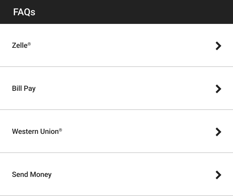
Two of the three layers came out and the hub still read as a hub, which is what designing them severable was for. In that same session I proposed pulling the FAQs4 for four of the five features into the hub itself, a fraction of the lift of the layers we had just cut, and the Director confirmed it into scope. I had already designed the components those two layers are built from, which is most of the set above, and specified them to a build-ready standard: flows drawn tap by tap, states defined, developer notes on the interactions. The fast follow starts from a finished library rather than an empty file. Why FAQs: the cut layers were about speed and visibility. The gap I went after was a different one. Nothing in the hub said how Zelle and Send Money differ: Zelle moves money both ways with people at other banks, in minutes, while Send Money can only pay them, and not instantly.
The MVP That Shipped

Zelle History in Online Banking, With the Chevron I Proposed

Solution
Decision 1: One hub, and demand sets the order. Problem tackled: Nothing had ever forced the four money-moving features to be ranked as a set. Putting them behind one menu did, and the one customers asked for most wasn't in the app at all. How: A quick-action menu at the top carries the five features in a three-then-two grid, and the order is an argument rather than an inventory. Zelle takes the first slot, the feature customers were closing accounts over. Transfers follows as the most-used way to move money, then bill pay. Western Union drops to the second row as the least-used of the four the app had, and Send Money takes the last slot, because Zelle is what replaces it for consumers. Why: The hub only works if the thing customers came for is the thing they see first, and getting there meant moving two live products down. Product owners expected Zelle to overtake transfers outright, so the first slot is a bet on where usage is going rather than a record of where it has been.
Decision 2: Designing for the customer who can't use it yet. Problem tackled: Every eligibility rule behind the quick-action menu has a failing side, and the service behind it can fail outright. Left unspecified, either one puts a customer in a hub that offers money movement and then refuses it. How: The eligibility rules came from the product owner. What did not exist was the behavior for them. I designed the menu's arrangements at five, four, three, two, and one feature so it stays composed at every entitlement count, and designed what the customer sees in every account state those rules produce. Then the message for each way a customer can be turned away: an ineligible account, a failed connection, multi-factor authentication not set up or still inside its waiting period, and an unverified email address. Each one names what happened and what to do next. Why: At a bank, the customer who can't use the feature isn't an edge case, they're a segment, and the moment they're turned away is the moment they call support. It is also what made the hub buildable: the dev team needed a defined outcome for every state, not just the happy path.




Decision 3: Answers inside the hub, not only in the help section. Problem tackled: The support calls were customers asking whether Zelle was coming, being told it wasn't, and being pointed at Send Money instead. Once Zelle arrived, the app carried five ways to move money, two of them overlapping on the same job. How: The hub's FAQ set is the help section's own content, one component surfaced in two places, covering four of the five features. Transfer has no FAQs, so I designed the empty state for the one customer entitled to Transfer and nothing else: a written route to the rest rather than a blank panel. I built the wording from the bank's approved copy library, rearranging cleared phrases to fit, and "click here" came with them; a descriptive link label is the next change I would make. Why: The overlap is not a transition wrinkle. Send Money stays until our vendor supports small business, so it and Zelle sit side by side in the hub, and will for a while yet. Telling them apart is a question customers meet in the hub, so that is where the answers go.

Decision 4: Common actions and transaction history: cut, not abandoned. Problem tackled: Frequent tasks like sending a payment or managing recipients required entering a feature and walking its full flow every time, and nowhere in the app could a customer see money movement across features or across accounts: history lived inside one account's activity screen at a time, filterable only by deposits and withdrawals. How: The common actions layer carries four rows. Tap "Send a Payment", choose the feature, done. Sending a payment reaches four of the five, every one but bill pay; "Settings" reaches two. For the history, three controls do the work, and the one that changes how the feed reads is the sort: by date, or grouped by feature. Why: Together they turn the hub from a menu into somewhere a customer can act and account for their money in motion. Both were cut for dev capacity, not design merit, and both now run in a prototype I built for this case study.


Impact
Transfer & Pay Hub shipped in mid-July 2026 and Zelle arrived in it in August, so the numbers here are early. What the work settled, and how I will know whether it worked, are not.
What the Zelle dashboard shows:
86.5% to 92.4%
Zelle payments completing rather than coming back rejected, one day in each of the three weekly reports I have so far. That is the integration settling in, not the flow.
Zelle against the two features in the bank's monthly reporting: In its first two weeks Zelle moved more transactions than Send Money, the legacy product beside it, moved in the whole of August, and more than bill pay did. Send Money gave up about a fifth of its volume that month, while payments across Zelle and Send Money together rose by nearly half in count and only single digits in dollars: Zelle is adding smaller, more frequent payments, not only absorbing the old ones.
What the daily counts show: Zelle was climbing before anyone promoted it. It moved about one and a half times as many transactions in its second week as in its launch week. By the third, the first week of September and the first with a Zelle card on the bank's homepage, it was about double.
What's true now:
- The component set is no longer this feature's. It is in the design system, so the next team to build money movement inherits my states, not my screens
- Cutting the two layers cost no rework of what stayed, so the price of reopening them is a meeting, not a redesign
What it unlocks next: The fast follow for the transaction history and common actions. It is agreed in principle and not sequenced, so it is a case I re-make every other week in our UX and product owner meeting, against everything else competing for the same capacity.
Business outcome: The closures. Branches surfaced customers leaving over a feature the app didn't have, so the number that answers the problem is the closure rate. Before launch, what we had was what branch staff told us and what our executives were seeing in customer data. The bank counts closures every month, so the baseline exists, and two weeks into Zelle it has not moved. That is what two weeks should look like: the last time this number shifted, it took months of averaging before the shift was visible at all. It moves for more reasons than this hub, so I take it directionally.
North star metric: Zelle adoption relative to the other four money-moving features, which is the metric the org settled on. Only two of those four are counted on a basis I can set beside Zelle's. Western Union is counted in a different system, and transfers is not counted at the app's level at all. Zelle lives nowhere else in the app, so adoption on its own cannot tell me the consolidation worked; it tells me the integration landed. What it does settle is part of the order: whether the first slot belonged to Zelle ahead of the two features counted in the same monthly reporting. And transfers is the comparison I made the call on. Adoption is also the leading indicator on the closure rate: it moves first, and if it stays flat the closure rate has no reason to move either. The hub ran for a month before Zelle arrived, which would have been the baseline a same-day launch could never have given me: the other four inside the hub, before Zelle. I asked for it, and that month was never recorded. And Zelle arrived quietly, with no banner, no email, and no campaign, so the August number is a floor, not the ceiling. Whether customers could find the hub once it was there is a different question, and it is the one I cannot answer.
Supporting signals:
- Zelle completion, week over week: if it stalls, that points at our flow rather than the network
- The two channels that asked for Zelle in the first place: call volume about which of the overlapping features to use, which is the test of the in-hub FAQs, and branch visits where the Zelle question stops coming back
What I asked for and could not get: The app records no customer usage of its own. I pushed for it from the start of this project; there was no budget, and before I asked, nobody had. That cost three reads I would still ask for: where customers enter the hub from, whether someone who comes for Zelle leaves having used something else, and what the extra tap into the hub costs transfers.
So what is left is the bank's own monthly reporting, its Zelle dashboard, and what comes back by phone and from the branches.
Who reads it: Reporting sits with our AVP of Product Development and Customer Experience, one level under the Director who sent us into the branches where this surfaced. The north star was not handed down to us: it was settled in conversation, and design was in that conversation because I pushed to be part of the reporting. The adoption read starts from Zelle's August launch. The closure rate takes longer: thirty days is noise there, and ninety is a first read rather than an answer.
Learnings
Learning 1: I made the most-used way to move money harder to reach on purpose, and I still can't prove I got the trade right. I thought the cost at least had a number on it: transfers usage. The app logs none, so it doesn't. What it bought has none either, and what it was worth has none: no number will tell me a customer found bill pay faster because the hub existed. So I call it a trade, not a simplification. I would put the events in the dev spec beside the feature next time: a measurement plan with no line in the build is only a preference.
Learning 2: The naming collision wasn't in our product, it was in the one we were adding. The bank's legacy P2P feature is called Send Money, a verb and a noun, and "send money" is what Zelle's own screens say throughout. Apart, that was survivable. In the same menu, one product's name reads as the other product's instruction, and the customer most likely to be caught is the one arriving for Zelle who has never used either. Neither name was mine to change, so I argued for the only lever left, a qualifier, and kept arguing until it shipped: "Send Money", with "(Woodforest P2P)" on the line beneath. I check for that collision at the start of an integration now, because the vocabulary you inherit is the part you can't design your way out of later.
Learning 3: I had nothing but enthusiasm, and enthusiasm is not an argument. When dev said the transaction history couldn't be scoped alongside Zelle, I had nothing to answer with: no usage number, no support volume, nothing but the reaction in the room, and nobody in it was a customer. The argument for Zelle had branch visits behind it, staff counting customers they had already lost; the transaction history had my conviction and a mockup. The feature I most wanted to build is the one I brought the least to, and I would reverse that.
Learning 4: I was in the room when the date was set, and I didn't ask what the team could actually ship. We had the project a few weeks before PI planning, so I walked in with designs ready to discuss, and that head start is why I could re-scope quickly when the cut came. The May date was set against the business need. What nobody put next to it, me included, was what the team had been delivering per increment. I ask that question before I agree to a date now, in that room, because once a date is in trouble the only thing left to trade is the design.

The course that gets overdraft fees waived, rebuilt so customers can finally finish it.
Banking GPS is Woodforest National Bank's financial literacy course with a built-in second chance: customers with overdraft fees complete it, earn a certificate, and present it to a Retail Banker to have those fees waived.
The course itself had become the barrier. Customer Experience was collecting complaints my team read as accessibility failures rather than confusion: text customers couldn't make out against the background, screens a screen reader couldn't navigate, controls a keyboard couldn't reach.
What I designed, between mid-June and the end of July 2026, was all of it: 175+ screens covering the intro, three lessons, the quizzes, the survey, the reference pages, and the certificate, on an icon and illustration system I built from Getty and the bank's own brand guidelines to carry them. I specified states and interactions alongside the developer as I drew them, so the build moved with the design instead of starting after it.


The course intro screen. The 2008 design has run on a 2014 build ever since; the redesign trades its fixed device screen for a page that scrolls.
The Problem
Customers couldn't complete Banking GPS on their own: accessibility failures forced Retail Bankers to walk them through a course meant to be self-service, burning branch labor on interface support.
The complaints came from both directions: the customers who couldn't finish, and the branch staff who were doing the compensating. Moving through the course meant one page at a time, and the section links did not shorten the walk: they unlocked only as far as a customer had already reached, so nobody could skip ahead, and going back to an earlier lesson dropped them at its start to page forward again. Staff were reading screens aloud for customers who couldn't see them, and walking lessons again for customers who got lost.
Every customer who gave up mid-course was a fee waiver that didn't happen and a frustrated customer still stuck with the fees. Two Level A criteria failed on every page of the course, so the bank was exposed on ADA compliance and paying for it in staff hours at the same time. And underneath it all, a build that had gone more than a decade without meaningful investment. Rather than retrofit compliance onto a stack that old, we rebuilt on a platform our developer could actually work in.
Users & Audience
The audience is customers with overdraft fees: people the course expects to finish on their own, most often on a branch kiosk, sometimes minutes after a Retail Banker tells them the waiver option exists. They're navigating a moment that already carries some stress and stigma: they're at the bank because they overdrew their account.
The failures didn't land evenly. A customer with low vision, a customer working by keyboard, a customer on a screen reader: each of them met a course that had already decided they were not the user. They are the audience the rebuild had to satisfy first, and satisfying them is what set the standard for everyone else.
Behind them is a second audience: the Retail Bankers and branch managers. They weren't the design target; they were the design test. The goal was a course so clear and self-guiding that staff intervention would become unnecessary. That matters more than it sounds, because a session a Retail Banker had to step into still ends in a certificate: the fee gets waived either way, so the course failing at the thing it exists to do never shows up as a failure. The rate of those assisted sessions is what should grade this redesign.
Process
Step 1: One source of truth, signed off before a screen was drawn
I audited both prior versions screen by screen and flow by flow, comparing accessibility gaps, design decisions, illustrations, and themes. Then I synthesized the two audits into one master document: every screen, all current content, every flow, every gap I had found, organized so the whole team was working from the same picture. It was built in Adobe XD, where the shelved version's files still lived; the new design was in Figma from its first screen. My design managers and fellow designers reviewed and validated the document. Why this order: with two prior versions and years of accumulated opinions, designing before consolidating would have meant relitigating history in every review.
Step 2: Four directions, eleven screens, one decision
I built four visual directions rather than defending one, and applied each to the same eleven screens so the comparison was like against like: an update of the shelved version, to find out whether the objection had really been its illustrations or the idea underneath them; an update of the design already in production, still roads and cars and the look of an actual GPS unit; a minimal, modern treatment that traded illustration for color blocks and sat inside the design system from the bank's website redesign; and a Route 66 mid-century road trip.
My design managers chose mid-century, and it won on being distinct and memorable. The design-system option is the one I would argue for on most products, and it is the call I made on the kiosk itself. This course is the exception because of where it lives: Banking GPS isn't part of the kiosk's interface, it's its own microsite a customer opens from a kiosk, from the bank's website, or from any desktop, so looking like everything around it buys less than having a place of its own. Why this method: visual direction was the project's biggest risk, so I put four realized options in front of the people who would decide while changing it was still cheap, and made one of them their own rejected version so the choice was informed rather than a reset.
Step 3: A system built before the screens it carried
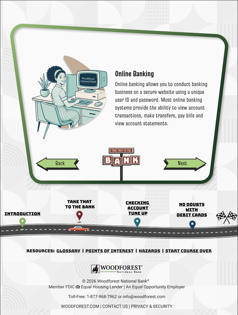
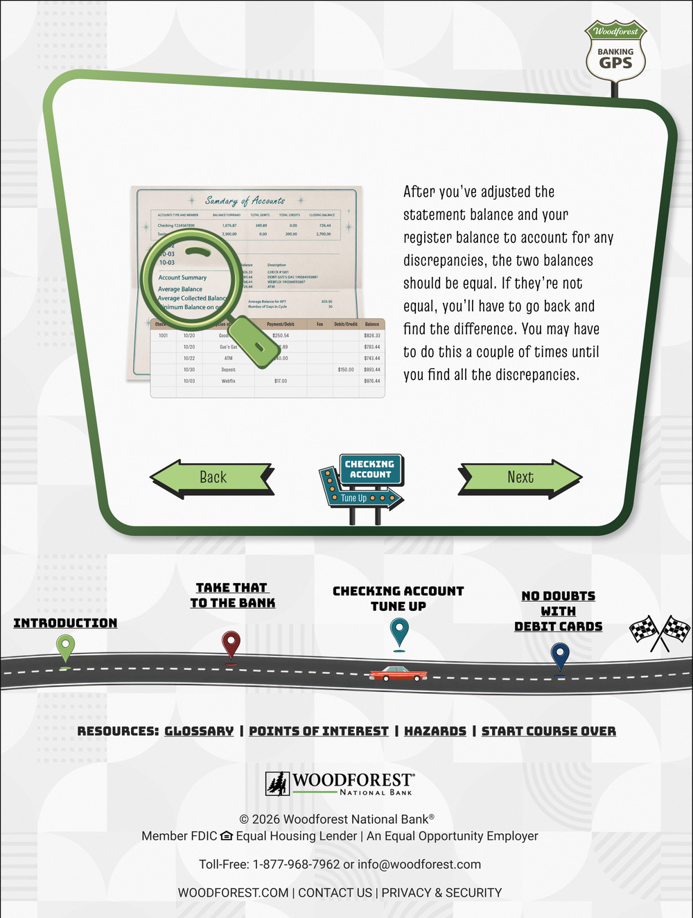
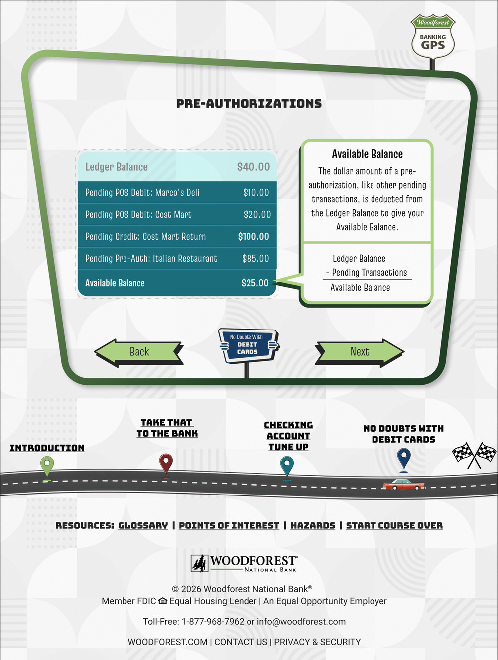
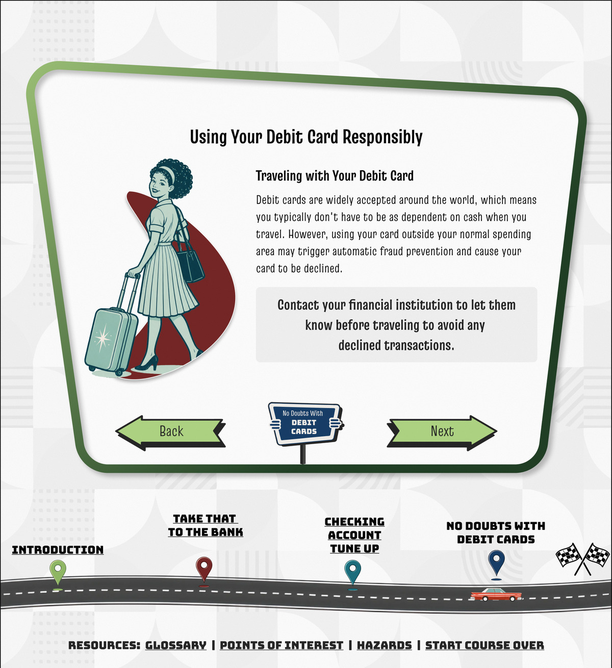
With the direction approved, I built the system that would carry it across 175+ screens. Very little of it started from a blank canvas, which at that volume was a decision rather than a shortcut: the icons came from Getty and from Woodforest's own brand guidelines, restyled until a bank icon and a mid-century one read as the same family, and the illustrations started as a Getty moodboard. I iterated on that base with AI image tools instead of redrawing by hand, until the people, the styles, and the situations matched the audience and the screen. Mid-century road signs mark the sections, atomic-era symbols run through nearly everything else as an accent, and I held the period typography to every job at once: a comfortable minimum body size, signage and running text alike, and the quiz above all. Why system-first: at this screen count, designing without a repeatable system means drift, and drift is exactly what an accessibility-driven redesign can't afford.

The System in Use: One Screen From Each Lesson, in Course Order
Step 4: The reference content, out of the overlays
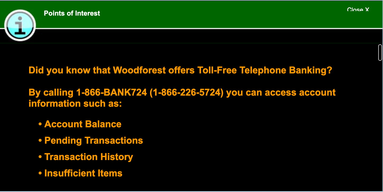
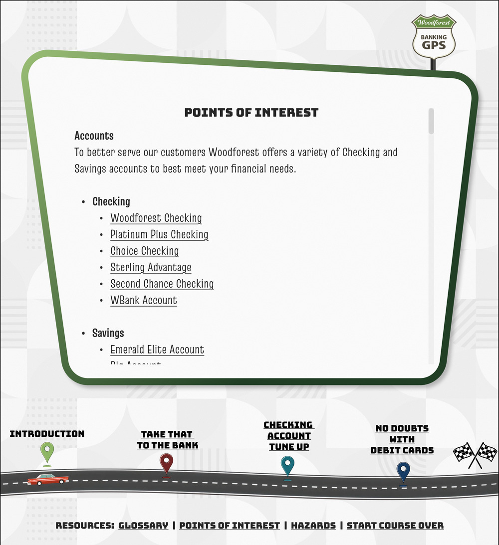
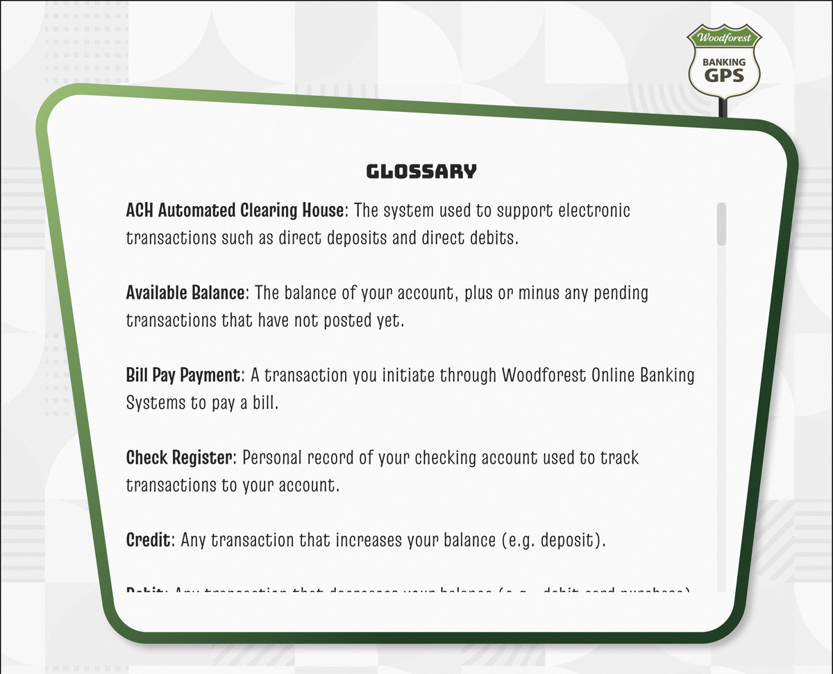
The glossary, the points of interest, and the hazards were the worst of it: three reference overlays that scrolled by pointer and nothing else, each showing a 280 pixel window onto content up to nine times taller (the points of interest ran the longest of the three), with no keyboard route to the rest. The shelved version had dropped them altogether; I caught that while building the audit document and put all three back. The individual points and hazards still sit inside the lessons, working as they did before but with stronger contrast, larger type, and more room to read.
Step 5: The audit as the punch list
Content stayed; presentation changed. I migrated all of it into the new system and then worked the audit as a punch list. It ran to fourteen failures; these four are the ones worth showing. No control in the shell cleared both target size and visible focus.
- SC 2.5.8Target Size The lesson tabs and the reference links stood 15 and 16 pixels tall against a 24 pixel minimum. I redrew the targets to size.
- SC 2.4.7Focus Visible Nothing in the shell showed focus, the Prev and Next arrows included: the only two that cleared 24 pixels, and the only page-to-page control a keyboard has. I gave every control a visible focus state.
- SC 1.4.3Contrast A right answer was confirmed three ways: a check, a header line, and the option turning orange at 2.9:1 against the teal panel. A miss got no words: an X, their own pick in red at 1.6:1, and Next disabled until they found an answer the course never showed them. I moved the feedback out of the question and into a Review Your Knowledge pass, where the right answer and the one the customer picked are each named in words as well as marked and colored, measuring 5.0:1 and 4.7:1 against the card.
- SC 1.1.1Non-text Content The artwork was painted on as CSS background images with no text alternative, so on the screens that carried their meaning in the picture (the check register and the balancing examples), a screen reader got the setup copy and nothing of the picture itself. I put that content in the page rather than on it.
Step 6: Screens into code while the rest were still being drawn
Once the main illustration work was done I released the screens that were ready, and the intro and the early lessons went into code while I was still detailing the ones behind them. The handoff surface was the Figma file itself, in Dev Mode, rather than a spec written after the fact, so the developer pulled states, spacing, and assets straight from the source while I kept working on what he hadn't reached yet. The platform came out of that same working relationship: the developer proposed Blazor, I researched it and made the call, partly because he already had the experience to move fast in it. What came back out of my design managers' review was copy: quiz wording, not layout or interaction. On a project this size they were in it far earlier and harder than managers usually are, which put the peer read at the end instead of along the way. Why the file was the handoff: on a course this size the expensive part isn't the first screen, it's every change after it, and a developer working from the live file absorbs those instead of building around them.
Solution
Decision 1: A whole visual language, not a coat of paint. Problem tackled: The old design was dated and inaccessible. My design managers wanted a complete identity refresh, and the urgency came from above them: the same complaints Customer Experience was collecting had reached an executive, who made the course a priority. How: Took the Route 66 mid-century direction through every screen of the course rather than the handful that would have sold it, so a customer meets the same language on a lesson, a quiz, a reference page, and the certificate. Why: The road-trip metaphor does real work: it frames financial literacy as a journey with a destination, matching the course's existing GPS naming and structure (points of interest, hazards). Mid-century style is warm and approachable, which matters for an audience arriving with stress and stigma already attached. And the style is not in tension with the standard: mid-century commercial art is built on flat color and heavy weight, so contrast and legibility come with the look instead of being negotiated against it. I took that on knowing what it would cost: the course needed its own material for every screen, and producing it meant learning a way of working I had not used before.
Decision 2: Sourced and restyled, not drawn from scratch. Problem tackled: Stock and the bank's own brand guidelines couldn't, on their own, hold one visual language across 175+ screens or guarantee the clarity accessibility requires. How: Used Nano Banana and GPT Image 2 for the work neither source could cover: changing the people in an illustration, reconciling styles across sources, and generating assets where there was nothing to buy. Why: Owning the system meant controlling contrast, sizing, and visual meaning for WCAG compliance, and meant the people in the course could reflect the people taking it. The cost was capacity: sourcing does not save the restyling, and I customized every asset in the set one at a time, which made the course nearly my only project.

 The AwardFlat brand mark, restyled with the course's cream highlight and a second tail.

 The BoomerangOne licensed ornament, filled and recolored per scene across the course.

 The Good Effort IconLicensed from Getty, then lifted off its distressed tile and recolored to the course's green and cream.
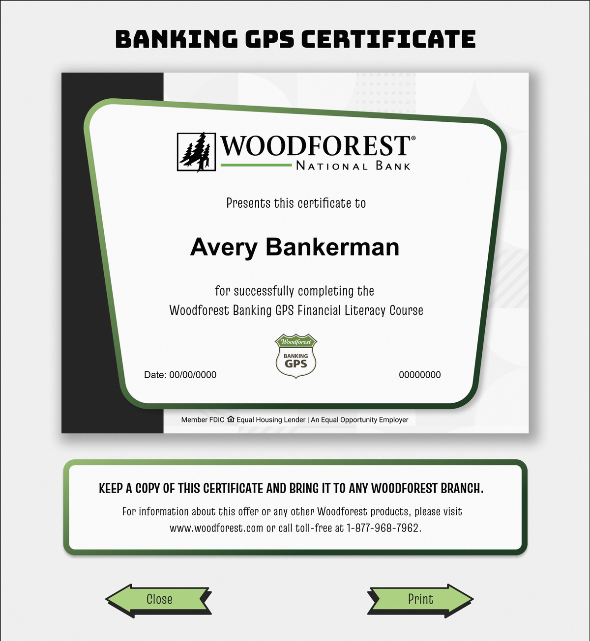
Decision 3: Composition was the only tool the platform gave me. Problem tackled: The certificate, the artifact that earns the fee waiver, had to come out right on any device a customer might print or save it from. Everything on the certificate is a fixed image except three live text fields: the customer types in their name, the one thing the system doesn't already have; the date and session ID generate themselves. How: Sized the name area in the middle of the certificate for the length of a real name rather than a placeholder, and set the three live fields in Arial. The certificate prints from the page itself, so the typeface has to already be on the machines customers use, and Arial is on effectively all of them. That is the trade, and it shows on the certificate itself: the customer's own name prints in Arial while the certificate's fixed artwork stays in the course's face. Why: Built this way, the certificate arrives at the Retail Banker intact, however the customer carries it there, and that handoff is the one moment the course exists to reach. A certificate the system can't compose never arrives at all. The certificate does everything I wanted but one: a Retail Banker can look one customer up and see they finished, yet the platform has never totaled the finishers.
Decision 4: Reference material on a page, not behind a pointer. Problem tackled: The three reference overlays were the most serious finding in the audit: 53% to 89% of that material was out of a keyboard's reach, depending on the overlay. How: Promoted each of the three to its own page of the course, and left the inline points and hazards where they already were. Why: The cheaper fix existed: leave the overlays in place and give them a keyboard route, which answers the audit finding and nothing else. But inline and on a page are two different jobs. A point or hazard inside a lesson teaches at the moment it applies; a page makes the same material something a customer can study and come back to. The glossary card still scrolls, but at page scale inside the course's own navigation, not through a keyhole over a lesson. Reach was the audit's bar. Use was mine.
Impact
Banking GPS ships soon, and nobody has ever been able to say whether this course works. It has been asking every customer who reaches the end whether they were satisfied and whether they understood banking any better, and I have never met anyone who reads the answers. My design work is done; what follows is how I intend to find out, and why part of it has to happen before the course goes live.
What's true now: The next person to touch this course inherits a system rather than a style. I settled the icons, the type scale, and the contrast rules, so their choice is only what to teach. And the three reference overlays are pages in the redesign, which is what makes them countable: an overlay produced no page view, so nobody could ever say whether the glossary was used. Once tracking is in, the next person will be able to.
The conformance read: Siteimprove, the monitoring platform going into the redesign, will scan the shipped build continuously, but a scanner is the floor rather than the finding set: my automated pass over the old course returned three of the fourteen failures. I measured the other eleven by hand, and all four this study shows are in that eleven, so the real check is walking the shipped build the same way, and that is on me.
What it unlocks next: Not more lessons. When tracking shows a section losing people, reworking it costs a screen rather than a project, because the system it is built from already exists.
Business outcome: the relationship, not the fee. A waived overdraft fee is money the bank chooses not to collect, and our Retail Communication and Documentation Manager made the point that settled it for me: you cannot market it. Publicizing that fees can be waived advertises free money and invites the people who would treat it that way. But used as intended it is not a giveaway, it is forgiveness with a condition attached. A customer who made a mistake, sat through the course, and left without the fee has a reason to stay. That is what the course is buying, and it is why volume is the wrong thing to aim at. Nothing I can install reads a reason to stay; the closest I get is how often customers finish without help.
North star metric: The rate of assisted sessions. Page-level tracking cannot tell a customer clicking Next from a Retail Banker clicking it for them, so I am asking the Retail Bankers instead, in one short survey that needs the internal communications channel rather than the research budget this project never had, fielded before the redesign ships and again after. Even then a drop in that rate is ambiguous on its own, because either the course got easier or people gave up instead of asking. Completions separate those two, and they will carry the weight from launch until the second survey wave lands. They are not a clean read either, because an assisted session still earns a certificate. What a missing one will show is a customer who gave up without anyone carrying them through, and the page-level data will add where they stopped: a course that lost them at screen forty is a different problem from one that lost them at screen four.
Supporting signals: Bounce rate and session time are table stakes. The two that matter are not. The course has never produced a completion count. Siteimprove will count certificate generations, which is the closest thing to a finish that build produces. And the course has never had a drop-off curve, eighteen years running. That is the one worth building for.
Who reads it: The reporting will run at page level across the redesign, and it will go to the Retail Communication and Documentation Manager, the same person who framed what the course is really buying. I am leading the conversation with her about which metrics we set.
The before I am still arguing for: The Retail Banker survey gives me one baseline. Neither it nor the end-of-course answers give me the course's own numbers, and those are the ones App Support, the team that keeps our applications running once they launch, can turn on. They are already installing Siteimprove in the redesign; what I am asking is that they do the same on the course we are replacing, and the push-back is still to wait. My position is that a post-launch number with nothing behind it settles nothing, and that the day the new course ships, the old one's numbers stop being collectable for good. The shape I want is symmetrical: survey the Retail Bankers, run a month on the old course, launch, run a month on the new one, then ask them the same question again.
Learnings
Learning 1: I built four directions rather than defend one, which meant my own default could lose. It did. My design managers picked mid-century; the design-system option, the one that had just shipped on the kiosk, was not it. I drew eleven finished screens for each of the four, knowing three would be turned down, and that is what the method costs. Defending my default would have been cheaper, and it would have made a standalone microsite look like a section of the website it sits outside. I run the bake-off now when I am most sure I do not need one.
Learning 2: I finished my design work before I had secured a single number to judge it by. I am making the measurement plan at the end of a project, which is why it is still an argument rather than a decision: the team I need it from has a launch in front of them, and waiting costs them nothing. It may cost me the baseline only the old course can give. One thing will be measurable regardless, and I did not choose it for that: the audit would have settled for a keyboard route through the overlays, I moved the material onto pages a customer could come back to, and pages are what the reporting counts. I would have spent the first week of this course on the number instead of the last.
740 branches, one kiosk, redesigned to remove the frustration that made customers give up mid-task.
Woodforest National Bank puts a self-service kiosk in every branch: a desktop machine a customer sits down to and drives with a mouse, and the primary digital access point for customers without home computers. When the bank pushed loan applications online and told branches to fall back on paper only when they had to, senior leadership mandated two things: that the loan flow run natively on every branch kiosk, and that the redesign leave the kiosk more accessible than the design it replaced. Running natively is what decided whether the branch got credit for the application. The button labels were hard to read from where a customer sits, and the old design drew the same fixed 800×600 box on every machine in the fleet, whatever that machine could actually show.
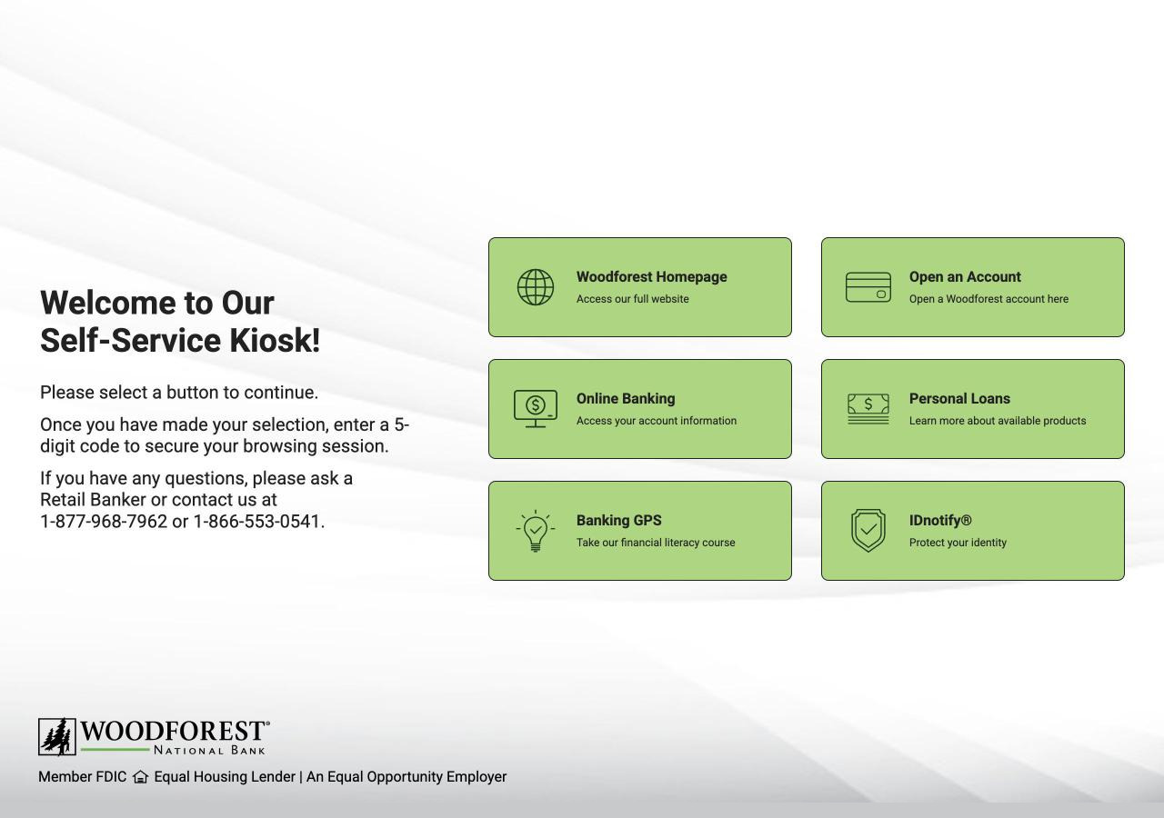
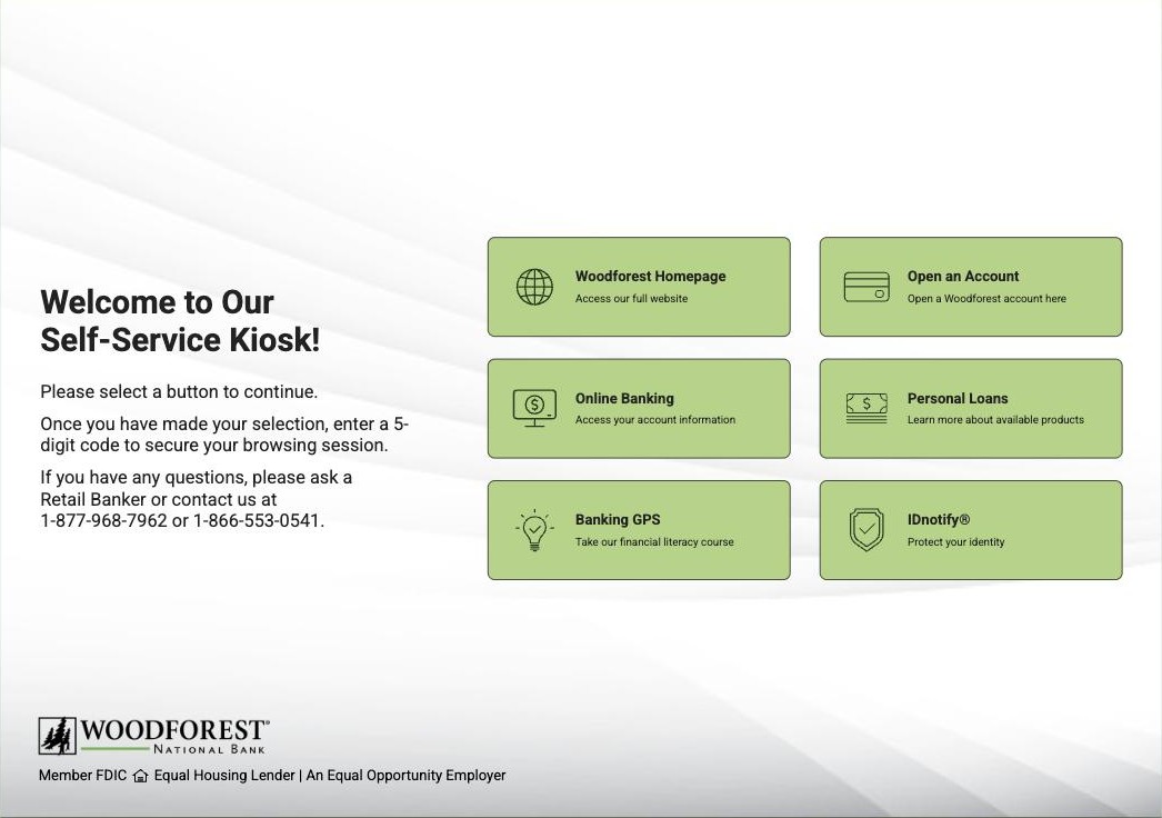
Between March and May 2026 I led the redesign of every screen on the kiosk, the first in its history, working alongside a product owner and a developer. It started below the pixels: a device inventory across all 740 branches, then a business case that won approval to re-equip the 13 still stuck at 800×600, which had been setting the design for all of them. With the canvas full, nothing could grow, so the accessibility mandate depended on the hardware moving first. I rebuilt the UI on the bank's website design system and swapped the columns, so the explanation comes first and the six buttons sit in one even grid instead of a stack of four beside a stack of two.
The Problem
A customer who could not finish on the kiosk had one way out in the branch: the paper form the bank was steering everyone away from. Once the application moved online, a Retail Banker could step in and help, but nobody could take it off their hands.
The kiosk at Woodforest is not a secondary channel. Everything a customer can do digitally inside a branch runs through it: loan applications, product exploration, online banking, the Banking GPS financial literacy course, account opening, identity protection, and the bank's website.
Loans were the exception. The old kiosk could reach the loan pages only by handing the customer off to the public website, and an application started that way carried no record of the branch it began in: the credit went to the online channel, or to whichever branch sat nearest the customer's address rather than the one they were sitting in. A branch could lose credit for a loan it had earned. Leadership's answer was to put the whole loan application on the kiosk itself, which meant fitting it into a canvas that was already full.
Customers now did it alone, on a screen still built for 800×600, every control drawn to fit a display far smaller than the one it was running on.
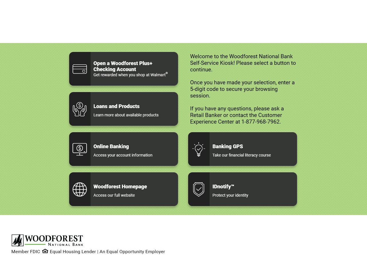
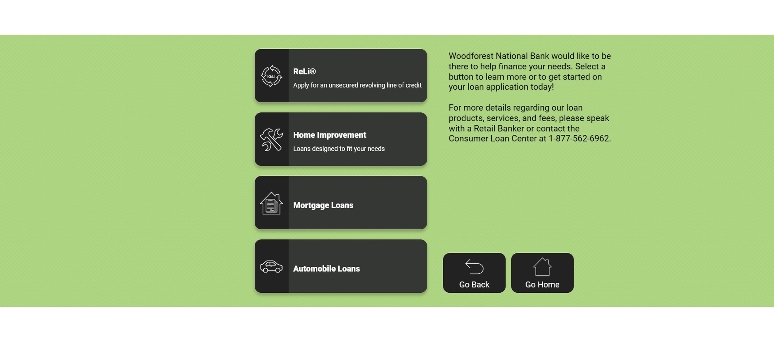
The layout inverted natural reading flow: a column of buttons came first and the explanation sat to their right, so customers met the actions before they understood the page. The product and destination button labels were white on charcoal, a pairing that blurred them at a normal sitting distance. Some of the icons were there because the slot wanted one rather than because they named the action.
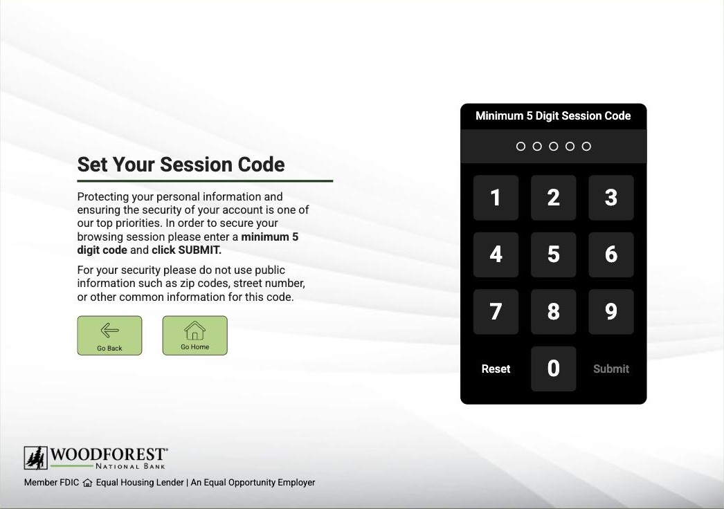
The session code screen showed the same inversion at its worst: the explanation of why the code mattered sat to the right of the keypad it described, and Submit, the control that finished the job, carried a label at 1.92:1 against its own background, while the number keys beside it read 15.91:1.
The branch staff I asked reported the same thing everywhere: customers needed help with even basic tasks. At three branches, more than once, they had seen a customer leave the application unfinished and the branch behind them.
Users & Audience
The primary audience is in-branch customers banking on the kiosk because it is the machine in front of them. Some own no computer. Some own one and cannot afford to keep it connected. Some have both at home and are already in the lobby, and are not going to drive back to start over. Their confidence with software they did not choose varies as widely as the reasons they sat down. What varies most is not what they came to do. It is what they can comfortably read, aim at, and hold in their head at once.
The old canvas left no room for that range. The type was already squeezed to fit it, so a customer who needed the text at twice the size had nowhere for it to go, and the density that merely felt tight to a confident user was where a less confident one stopped.
I did not have research with customers who need those accommodations, and I did not need it to know the ceiling was the problem: at that canvas size the kiosk could not have met them even if the design had tried.
The secondary audience is branch staff: the Retail Bankers and branch managers who absorbed whatever the screen could not carry. Every assisted session pulled one of them off their own work. Widening the range of people who could finish alone was the same work as giving the branch its floor time back.
Process
Step 1: The spreadsheet that moved the design floor
The design floor moved because of a spreadsheet I didn't bring. The product owner brought it to a working session with me and the developer: a pre-sorted sheet of every branch's screen resolution. Reading it, I saw the gap: 13 branches still sat at 800×600, an old resolution with nothing near it; about 40 more sat a class above at 1280×900, and the rest of the fleet started higher still. So I asked what it would take to re-equip the stragglers and design to the higher floor, and the three of us built the case both ways: the 13 at the bottom alone, mostly monitors rather than whole machines, which would leave the floor at 1280×900, or the 40 as well, which would lift it to 1920×1080. We needed the 13. The larger case went up beside it to find out whether leadership would buy more than we were asking for. It ran to six times the money for four times the branches, because it bought a higher panel for about 53 branches and whole machines with some of them. Our Director of Product Development and Customer Experience approved the narrower option. The design target became 1280×900, the exact fit of the lowest-resolution device that remained. Why the spreadsheet came first: 800×600 had no headroom left for larger type or larger targets, so every enlargement the redesign depends on started in that sheet.
 1920 × 1080the case not taken
1280 × 900the room the new floor bought
800 × 600the old canvas
1920 × 1080the case not taken
1280 × 900the room the new floor bought
800 × 600the old canvas
Step 2: The website's system, refit for a seated machine
The case for giving the kiosk its own language was real: the website, the app, and online banking meet customers outside the branch, and the kiosk is the one digital product inside it. That same fact is why it lost. Walk into a branch and everything is already one brand: the logo, the color on the walls, the digital signage, the Retail Banker's name tag, the flyers on the counter. A kiosk in its own language would have been the one thing in that room that didn't match, so the brand had to be in its foundation, not a skin over a kiosk-only design. The website's system had also been through WCAG testing already, and it kept passing here as long as the textured background I put behind it stayed light enough to read as white.
I took that system, from the website redesign I had led, which shipped the previous year, and refit it for what this machine actually is: a dedicated desktop running one portal, driven by a mouse, read from a chair. I gave the screens a heading level they had never had, brought the reading copy up for that distance, and rebuilt the spacing and grid for 1280×900, all inside the mental model the old kiosk had spent years setting, down to keeping most of its icons. Every machine above that floor inherits the content at the same size, with the surround growing to fill the rest of the screen rather than leaving it empty. Every target got a floor of 70 pixels: the navigation row sits exactly there, the keypad keys at 80, every choice button at 110. The keypad set the 80, because once everything that screen needed was in place that was as large as its keys could go. I checked contrast and target sizes screen by screen as I went. Why 70 held: it clears the 44 pixels WCAG's strictest target-size criterion asks for, leaves the margin a customer aiming with a branch mouse needs, and leaves room for a label to double at 200% text scaling without the target growing.
Website
default
hover
Kiosk
default
hover
What Carried Over
#AED581fill#222222text and icon#555555fill, on hover#FFFFFFtext and icon, on hover8px corner radius
Roboto, Bold and Regular
What Was Refit
Website→Kiosk
one 24px label→an icon, a 16px title, and a 12px description
372 × 53→334 × 110
38px narrower, 57px taller
Step 3: The loan path, kept on the kiosk instead of handed off
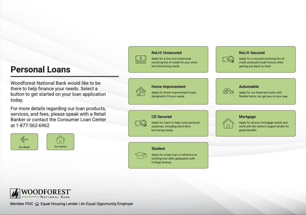
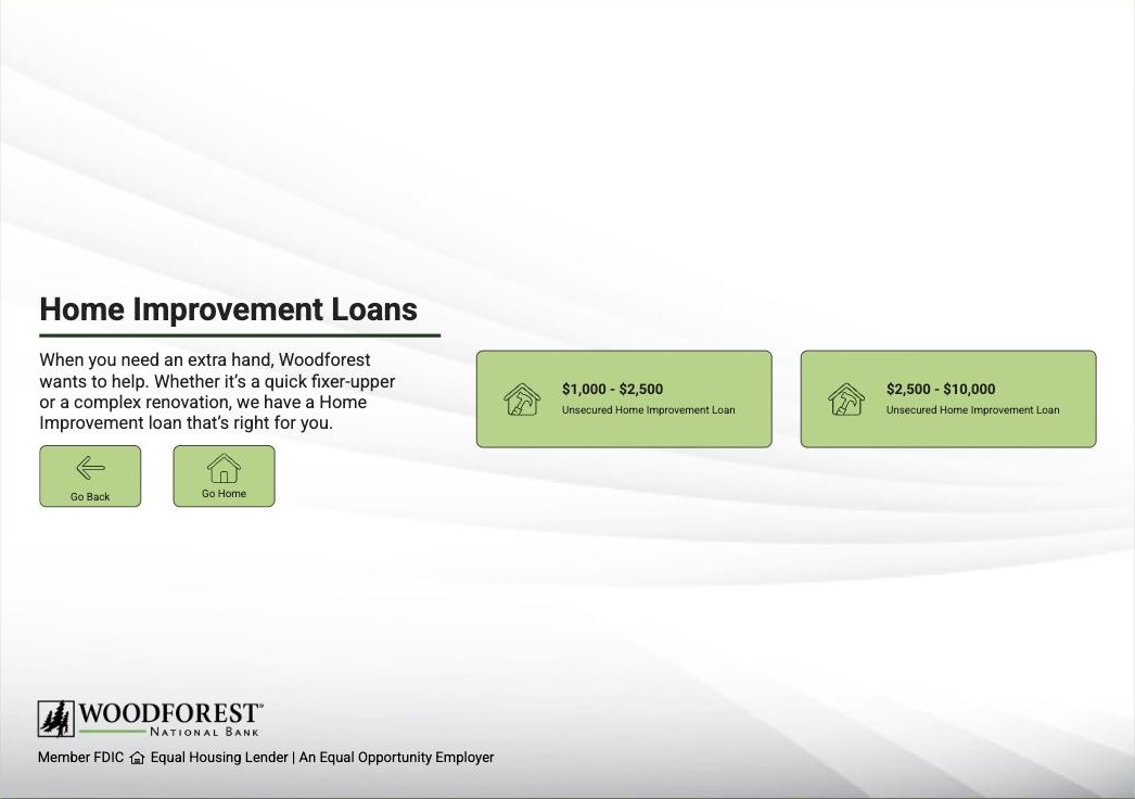
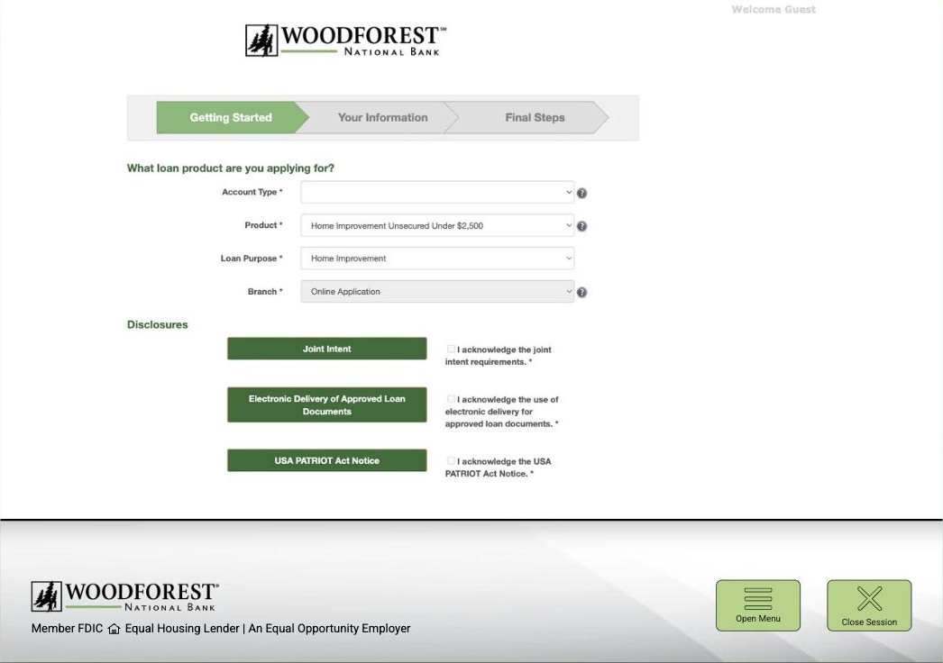
The loan flow itself was mine end to end, and it is where the mandate got designed. The mandate said the loan had to run on the kiosk; it did not say where the choosing happened. The choosing happens on the kiosk: Personal Loans, then the exact product (home improvement goes one further, into amount bands), and only at the end does the application open inside the kiosk's secure browsing session. By the time the form appears, the loan is preselected and the branch's identifier travels with it. The navigation is the attribution mechanism.
Step 4: The spec that came back with its screens untouched
The design moved as a spec, and the spec moved up. My fellow designers critiqued it first, my design manager approved it, and the product owner carried it to the two directors the mandate ran through: our Director of Product Development and Customer Experience and our Managing Director of Small Business and Customer Loans, working in tandem because loan applications sat under them both. The design came back approved with the screens untouched; the directors' notes changed the wording of the loan content and nothing else. Through the build that followed, I stayed in the developer's feedback loop.
Step 5: The finished screens, back in front of the branch
With the redesign finished and still weeks from shipping, I took the screens back out to branches I had not visited the first time, a second round with something to show, and put them in front of the branch managers and Retail Bankers who work beside the kiosk every day. Every person I showed it to said a version of the same thing: it was clearer, and they could see that in the first second. Not a formal test; a gut check with the people closest to the problem.
Step 6: Every deployed device, and colleagues who hadn't been told
The last stop was the floor at headquarters I think of as the fake bank, which keeps one of every device deployed across the branch network. I sat at each machine and read every screen from where a customer sits, then sat down people who knew the kiosk but had not been told there was a redesign, and gave each of them three or four asks in a row: apply for a home improvement loan, now the higher amount band, now an automobile loan. They took every one through to the application. Employees, not customers, and quick and dirty by design; it was the test available. None of it sent me back to redraw a screen, and every screen rendered, behaved, and held its layout on every device.
Solution
Decision 1: Design for resolution, not around it. Problem tackled: There was no heading anywhere on the 800×600 screen and no room to add one. How: I designed nothing until the floor moved. Moving it meant new hardware at 13 branches, mostly monitors. Why: The accessibility half of the mandate ran straight through this decision. WCAG asks that text scale to 200% without losing content (1.4.4), and that a layout keep working at a much narrower viewport (1.4.10). The first of those is a resolution problem.
Decision 2: The rule before the choice, not after it. Problem tackled: Four of the six buttons ran down the left, so a customer reading left to right met them before the copy explaining what was about to happen. How: Swapped the columns, on home and on every screen that repeated the pattern. The explanation moved left, the buttons moved right, and I re-ranked the six on the way: the Woodforest Homepage came up from the bottom row to the first slot, opening an account took second, and Personal Loans went fourth. Nothing on screen was squeezed to pay for it; the bill came due in hardware, not in layout. Why: On the old screen every one of those buttons ended up on the website, and every one of them met the same gate on the way: a screen demanding a 5-digit code. The only advance notice of that rule was the copy the old layout put second. The rule did not need rewriting; it needed to arrive first. Demoting the actions drew one question, from the product owner, who wanted the reasoning rather than a change, and that was the reasoning. The ranking was the same argument applied to the buttons themselves. Personal Loans is the reason the kiosk got redesigned at all, and it still does not lead, because the screen should rank what most customers came for rather than what prompted the project. We had no usage data to rank them with, so that order is our read of the branch and not a measurement.
Personal Loans, Before
Personal Loans, After
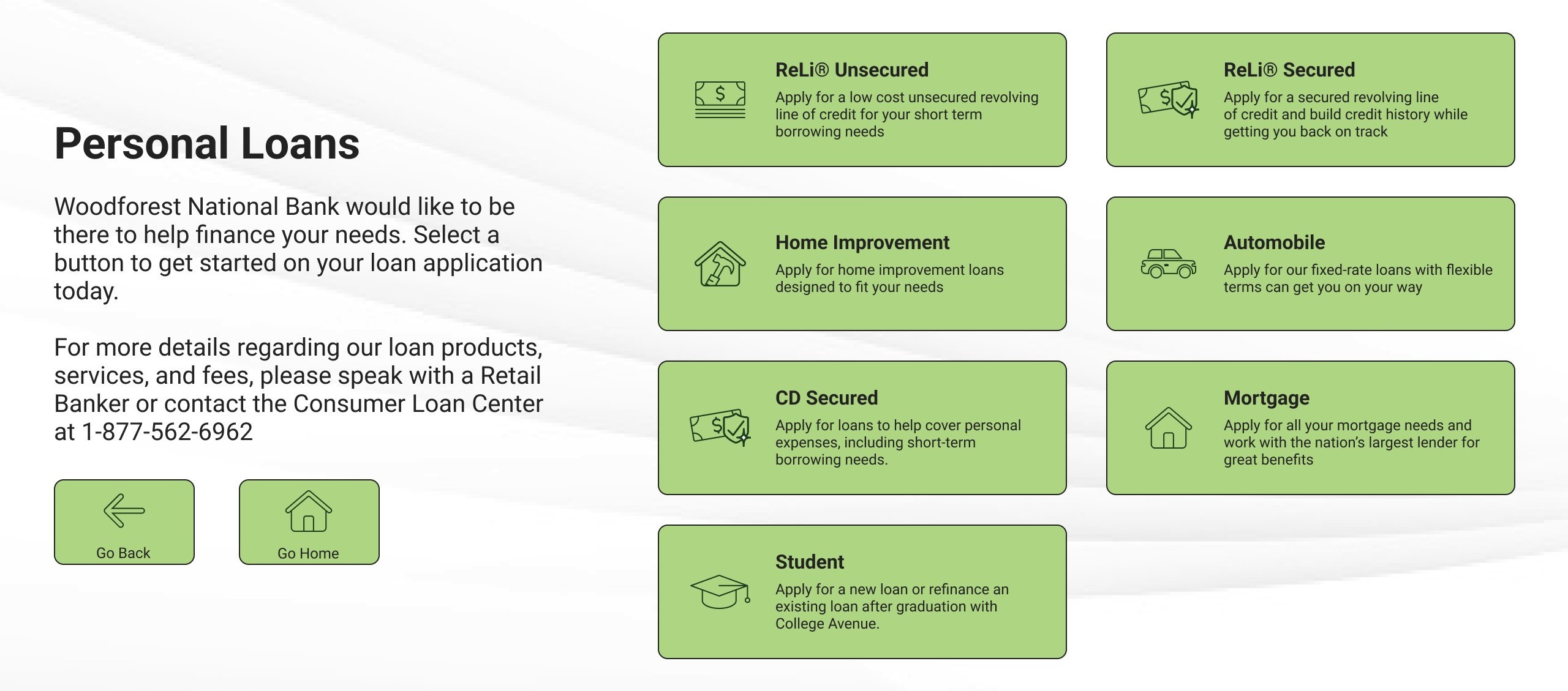
Decision 3: The bank's system, not a kiosk dialect. Problem tackled: The kiosk set its product and destination buttons in white on charcoal, where the letterforms bleed into their own background at a seated distance, worst on the bold titles a customer reads to choose. The green was already the bank's; the components were the kiosk's own, shared with nothing else the bank put in front of a customer. How: Took the website design system's button styles, color, and hover states directly, which moved the buttons a customer chooses from out of white on charcoal and into dark on green, and replaced the white-green-white band with a textured field that runs the whole screen. Why: An already-validated system eliminated guesswork on type weight and contrast, and it held the kiosk-to-web handoff together: when a customer moves into a web flow like opening an account, they do not arrive somewhere that looks like a different bank. The keypad was the exception. White on dark bleeds at distance, worst where the strokes are heavy. Size is the other half of it, and a keypad digit is set large enough to hold its shape. I drew four versions and we shortlisted two, one of them the same green as every other button on the screen. The black and white was ahead on the labels, and the keys are held apart by their shape rather than by the color behind them. My design manager and I also both thought the black one looked better. That is the one we took. The system was not free. On the website a button carries one label and nothing else; on the kiosk it carries an icon, a title, and a description, so the title gave up size to make room.
The One We Took
- Label on Key
- 15.91:1
- Key on Panel
- 1.32:1
The Other Finalist
- Label on Key
- 12.25:1
- Key on Panel
- 7.37:1
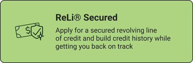
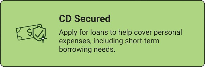
Decision 4: Pictures that name the loan, an explanation you meet first. Problem tackled: Not every icon named its button, and the session code screen kept its explanation on the far side of the keypad it belonged to, with the label on Submit barely lifting off the button under it. How: Replaced the icons that did not map to their buttons. Stated the 5-digit rule a second time, on the keypad panel where it is enforced, gave the entry field a visible indicator, and brought Reset and Submit up to full contrast, with Submit dimmed only while it genuinely is unavailable and coming up to strength on the fifth digit. Why: ReLi is a revolving line of credit, and it wore a ring of four arrows with the brand name lettered inside it: near enough to a recycling mark that the pun on revolving lands on sustainability before it lands on credit, at a size where the lettering was never going to be read anyway. Home Improvement wore a hammer and a wrench, which says tools and never says home, on a loan with home in its name. The Personal Loans screen also had to carry seven products where the old one carried four, so the names that picture nothing got a system rather than a picture: ReLi, in both its versions, and CD Secured share a bill, and a badge on it marks the ones you secure with something. That is where a picture stops naming the loan: on the two secured ones the title does it. The session code screen already explained itself in 77 words. I cut it to 56 and moved it in front of the keypad.

 ReLi UnsecuredNow a bill, which does not need lettering to say what it is.

 Home ImprovementNow a house with a tool in it, which says both halves of the name.

 MortgageKept its subject. Gave up the house-with-something-inside idiom, which went to Home Improvement.

 AutomobileKept its subject, redrawn.
One Mark, Two Products
Impact
The redesign shipped in June 2026 and is live on the kiosk in all 740 branches. One screen is still catching up: the updated session code screen ships separately, so the live kiosk runs the new design everywhere but there. The home screen is live in its Phase 1 form, the generic Open an Account button fleet-wide. Phase 2 will put one button, and the destination behind it, back on the small number of branches that carry Woodforest Plus+, and the kiosk's product owner sets when that wave runs. I have been back to one branch since rollout, a slow one where no customer came in the whole time I was there. What I got was the staff's read of the screens, the same reaction the pre-rollout branches gave, and nothing about how customers behave in front of them.
What shipped, and what it changed:
- Outlier devices re-equipped, the change that let the design canvas grow to 2.4 times its old area
- Content before actions, the rule on every screen the redesign has reached
What the loan report shows:
3.3×
Completed loan applications recorded as kiosk-sourced: the first eight months of 2026 against all of 2025, three of those months with the redesign live.
What it unlocks next: The session code screen and the Phase 2 button ship into rules that already exist. The components did not start here: I took them from the website's design system and refit them for the kiosk, and we built that system on our brand guidelines. Nothing we design sits outside them. Both the guidelines and the system are the bank's rather than this project's, so a vendor rebuilding the kiosk starts from the same components, WCAG testing included. Only a brand redesign undoes that.
Business outcome: The loan application runs natively on the kiosk now and carries the branch's identifier, so the branch a customer is sitting in gets the credit.
North star metric: Loan applications recorded as kiosk-sourced. The kiosk portal has no analytics and none are planned, so the number is not the kiosk's; it is the loan system's, and the Loans team already reports it. Kiosks and branch QR codes are now the only two methods that systematically attribute an application to the branch it started in, and they are counted as separate sources, so the kiosk has its own row. Its share of all completed loan applications went from 2.32% to 14.98%, and paper went from 38.27% to 3.92% over the same stretch as the push off paper rolled out. The shift was coming with or without me. What the redesign decided was whether the kiosk could take it without friction. What the count will not settle is who finished the application, since one a Retail Banker walked a customer through arrives looking exactly like one a customer completed alone. That is a question for the branches.
The branch survey: Branch visits stop at the ones I can drive to. A short survey will go out in our Retail Communication and Documentation Manager's newsletter, which reaches our whole retail department: everyone who works at a branch, and the people above them. It will ask what they make of the screens and what they watch customers do. It will also ask for a role, so I can tell a Retail Banker's answer from a manager's rather than choose the roles up front and guess which ones have something to say.
Supporting signals: I am holding the survey and any further branch visits until the session code screen lands, so the feedback covers the whole experience rather than most of it. The branch read will be what the people standing next to the machine can tell me. On those visits I will put the survey's questions to the managers who saw the screens before rollout, and to branches busy enough to have watched customers use them, asking whether customers are:
- Getting all the way through a task, not just starting one
- Still walking away mid-task, which is the failure the redesign was aimed at
- Interrupting staff at all, or having a Retail Banker lean over to point, which is the cost the old kiosk charged the branch
Who reads it: The count goes to our Managing Director of Small Business and Customer Loans, who carries it to our Director of Product Development and Customer Experience. Those are the two the mandate ran through. The branch read has no such route. Nothing on the machine produces it and no report carries it, so I collect it myself, starting with the people who told me what was wrong in the first place. Staying close to the branch is not extra diligence here. It is the only reporting line the screens have.
Learnings
Learning 1: I wanted to make this a showcase, and the kiosk had no use for one. My first instinct was to reach for gradients, illustrations, visual spectacle. But in a branch, the kiosk is how customers get to the services the bank has moved online. If I do my job right, they don't notice the design at all; they just know what to do next. I can tell the difference now between a project that has room for design to show, and one that just needs to work.
Learning 2: I shipped a fleet-wide redesign on evidence I couldn't have defended in a research review. This project was supposed to have formal user testing; it had been next on our research list when the funding went at the end of 2025. I went to more than ten branches across two rounds, a few at a time rather than in any single push. Retail Bankers and branch managers said the same things across the branches, and reacted the same way to the finished screens. That wasn't nothing; it was signal. It's not a substitute for rigorous testing, and none of it tells me what customers do in front of the screens that shipped. Woodforest measures almost nothing, so on every project since, finding some way to measure has been my job too.